Themes & Appearance
Make TruchiEmu yours with 16 accent color themes inspired by gaming legends—from Samus to Doom—plus custom colors, light/dark appearance modes, tinted surfaces, and accent-colored toolbar icons.
Overview
TruchiEmu's theme system paints the whole app around a single accent color. Pick one of 16 named themes each color-matched to a gaming icon or roll your own with a color picker. Light, dark, or follow the system, and choose how much tint shows up in toolbars and sidebars.
What You Get
- 16 Curated + 1 Custom Theme: Palettes named after iconic gaming characters and franchises, organized into Standard and Gaming categories, plus a Custom theme you can tweak to any color
- Appearance Mode: Light, Dark, or Automatic follow your system preference or override it per app
- Custom Colors: Pick any color as your accent with the built-in Color Picker
- Toolbar Accent: Optionally color toolbar icons with the accent instead of the system default
- Tinted Surfaces: Apply a subtle accent tint to window, sidebar, and toolbar backgrounds
- Per-Mode Adaptations: Many themes adjust their accent for better contrast in light vs. dark mode
How Theme Changes Take Effect
When you apply a new theme, TruchiEmu saves your preference and restarts the app to ensure every window reflects the change. The UI protects you from losing unsaved changes with confirmation dialogs.
All Themes
Every theme is named after a gaming legend and carefully color-matched to their iconic palette. Browse the full collection below.
Standard
Gaming
Appearance Mode
Choose how TruchiEmu looks alongside your system. Three appearance modes are available:
- Automatic: Follows your macOS system preference. Switches seamlessly between light and dark as your system changes.
- Light: Forces the light aqua appearance regardless of system setting.
- Dark: Forces the dark aqua appearance regardless of system setting.
The same theme adapts its accent color for optimal contrast in both light and dark modes
Per-Mode Color Adaptations
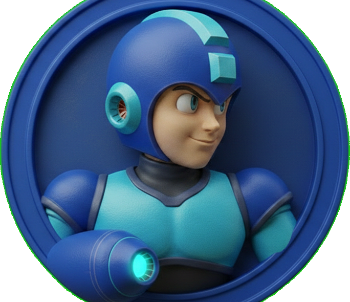
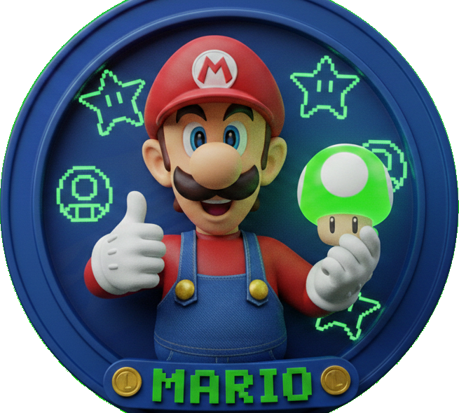
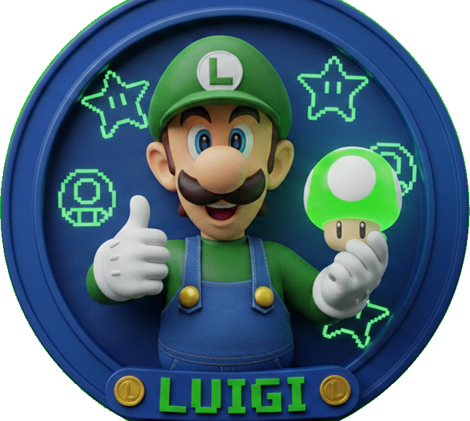
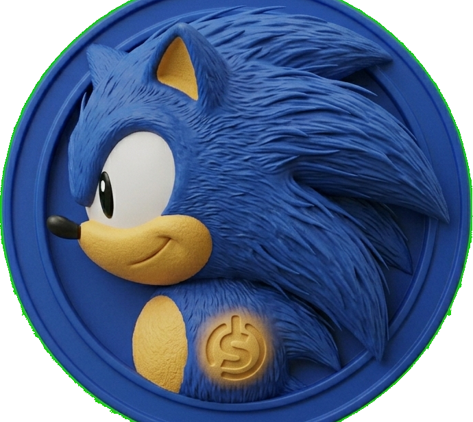
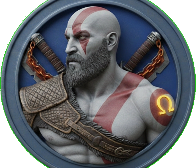
Many themes define distinct accent colors for light and dark mode to maintain readability. 9 themes have light-mode adaptations and 8 have dark-mode adaptations — including Mario, Luigi, Mega Man, Sonic, Doom, Kratos, Kirby, and Master Chief beyond those shown below. For example:
| Theme | Light Mode Accent | Dark Mode Accent | Why |
|---|---|---|---|
| Joker | Violet | Brighter violet | Boosted brightness for dark backgrounds |
| Protoss | Darker rose | Full rose | Reduced intensity for light backgrounds |
| Samus | Darker teal | Full teal | Darkened for contrast on white |
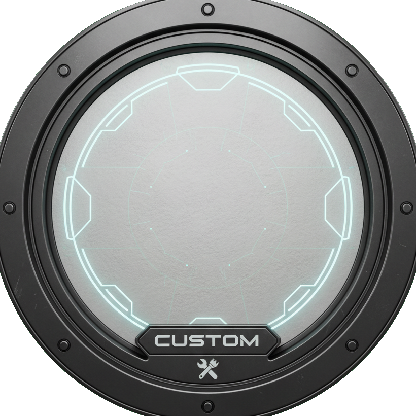
Custom Colors
Can't find the perfect accent? The Custom theme lets you pick any color as your accent using the system Color Picker. All dimmed and dark variants are algorithmically derived from your chosen color.
How it works: Select the Custom theme in the theme grid, then use the Color Picker that appears below it. Your custom color is saved automatically when you apply the theme.
Custom Theme Details
- Unlimited Colors: Choose any color from the full spectrum via the macOS Color Picker
- Auto-Derived Variants: Dimmed (84% brightness) and dark (70% brightness) versions are computed automatically
- Persisted: Your custom color is saved and restored on every launch
- No Per-Mode Customization: The same accent is used in both light and dark mode—if you need mode-specific colors, choose a built-in theme with per-mode adaptations
Configuration Guide
Step-by-Step Setup
-
Open Theme Settings
Navigate to
Settings → Generaland find the Theme section at the top of the page. -
Choose Your Appearance
Use the segmented control at the top to select Automatic, Light, or Dark mode. This controls the overall app appearance independently of your accent theme.
-
Select a Theme
Click on any theme icon in the grid. A checkmark overlay indicates your current selection. The theme grid shows all 17 options organized by category.
-
Pick a Custom Color (Optional)
If you selected the Custom theme, a Color Picker appears below the grid. Use it to choose any accent color you like.
-
Toggle Surface Options
Two additional toggles let you fine-tune how the accent color is applied:
- Accent-Colored Toolbar Icons: Colors toolbar buttons and segmented controls with the accent instead of system default blue
- Tinted Surfaces: Applies a subtle (4–8%) accent color blend to window, sidebar, and toolbar backgrounds
-
Apply & Restart
Click Apply Theme to save your changes. A confirmation dialog explains that the app will restart. Confirm to see your new theme take effect across every window and view.
Restart Required: Theme and appearance changes require an app restart to take full effect. This is because the AppColors statics are resolved at render time—a full process restart ensures every view picks up the new values.
Unsaved Changes Protection
TruchiEmu protects you from losing theme changes:
- Navigate Away: If you switch settings tabs with pending theme changes, a dialog offers "Apply & Restart", "Discard Changes", or "Cancel"
- Close Window: The window close button is intercepted when changes are pending, showing the same three options
Theme Gallery
A closer look at how different themes transform the TruchiEmu interface across both light and dark modes.
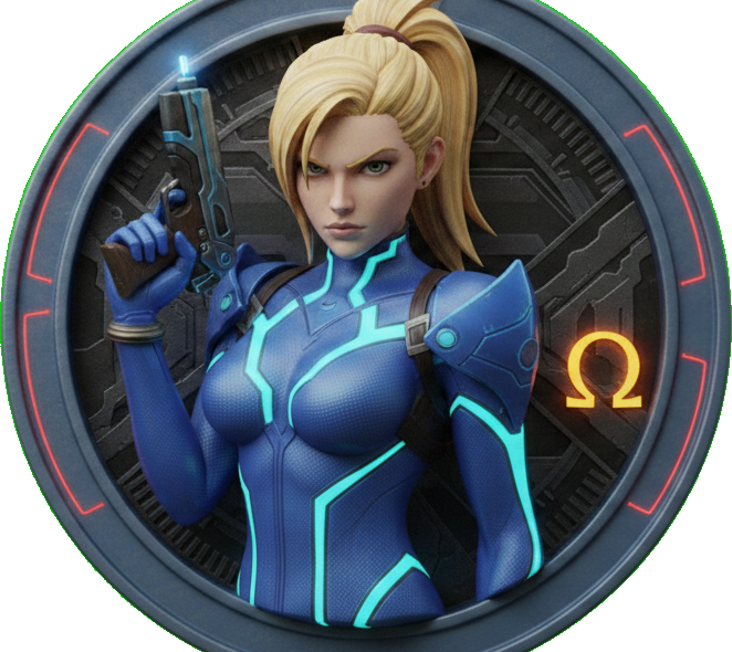
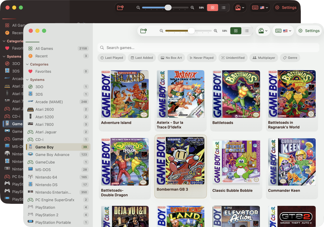
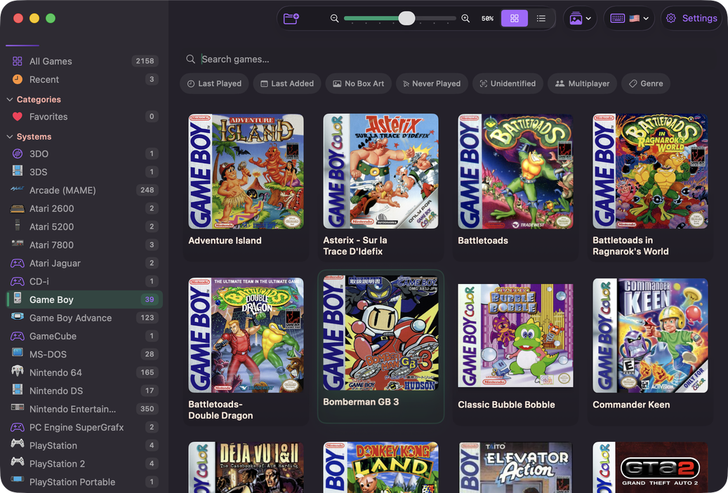
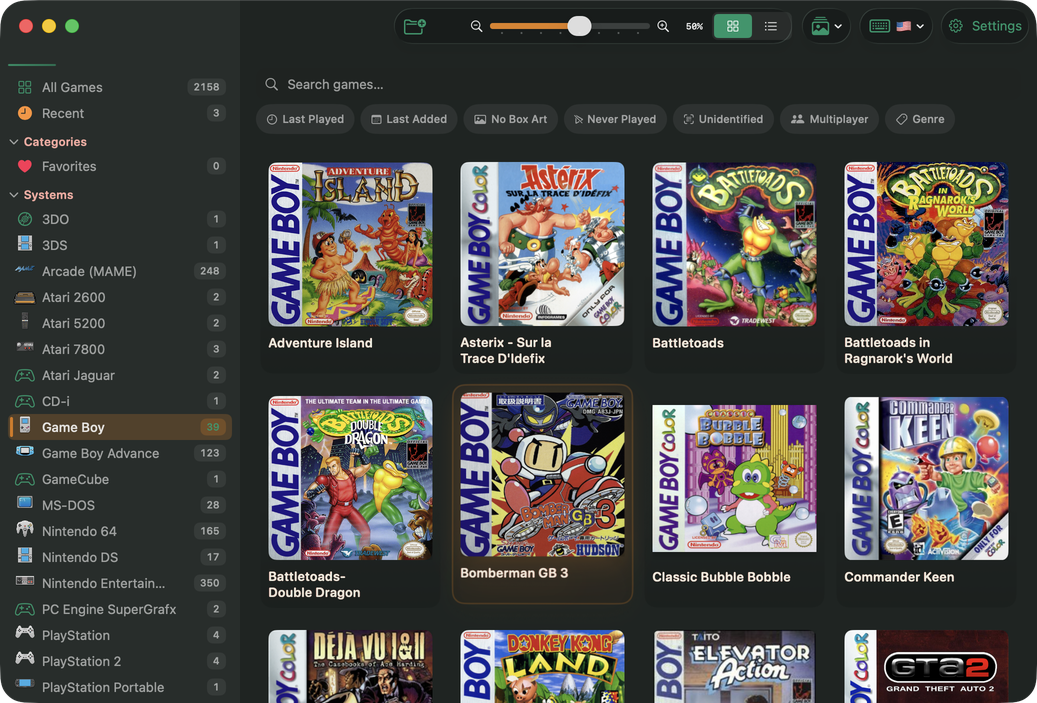
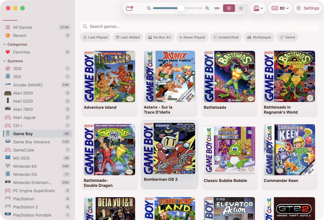
Samus
The default theme—a cool cyan-teal inspired by Samus Aran's iconic Varia Suit. Darkens in light mode for crisp contrast on white backgrounds.
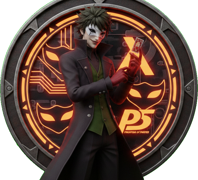
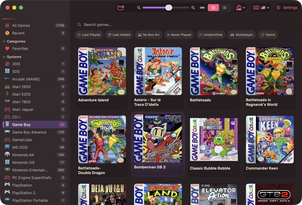
Joker
A vivid violet that brightens to a luminous lavender in dark mode—as unpredictable and striking as the Joker himself.
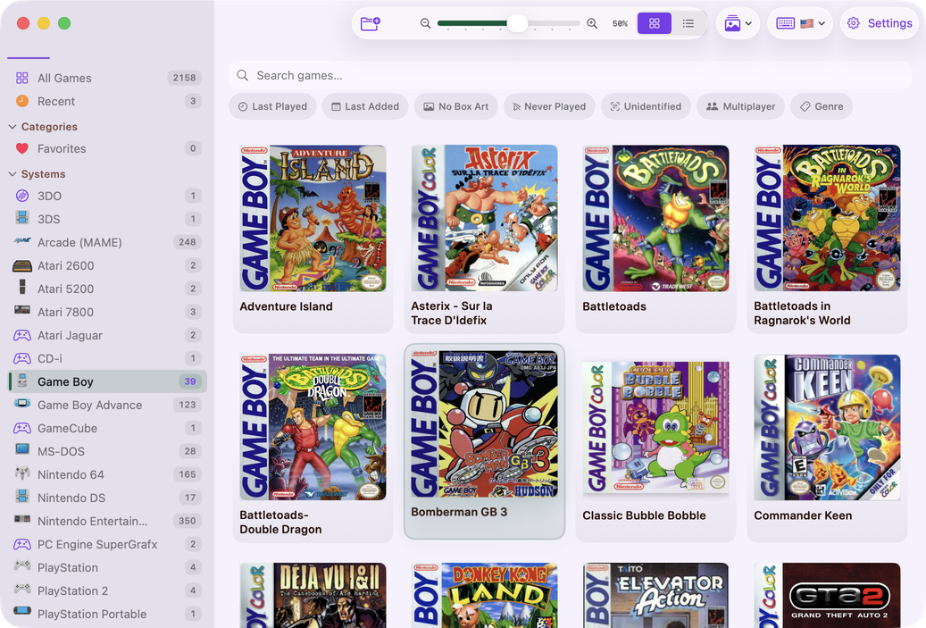
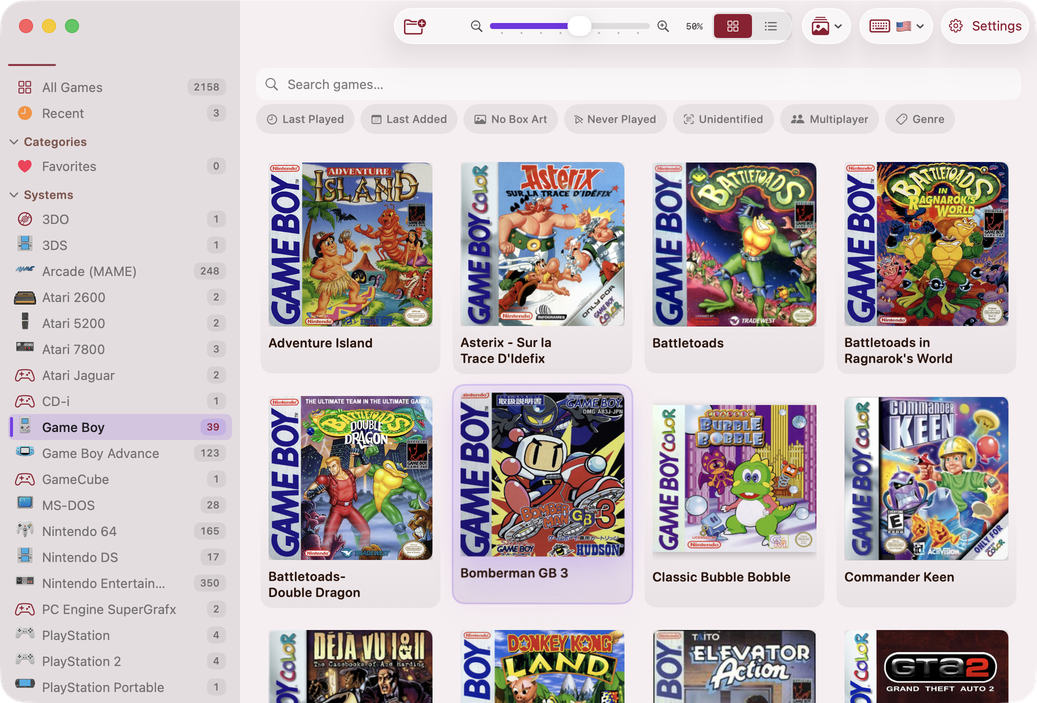
Protoss
A commanding rose-crimson that evokes the power of the Protoss. Tones down in light mode for comfortable readability.
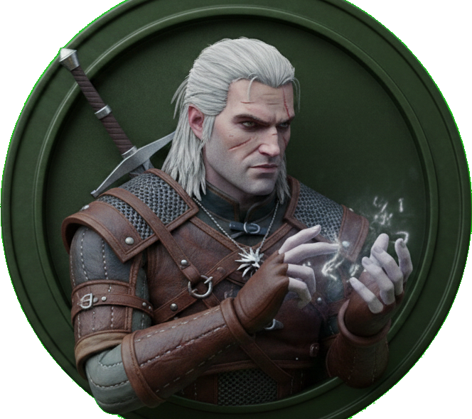
Geralt
A deep emerald-teal, as stoic and grounded as the White Wolf himself. Looks equally stunning in both light and dark modes.
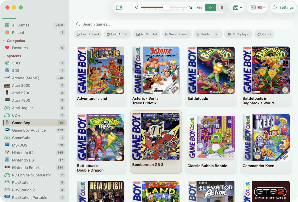
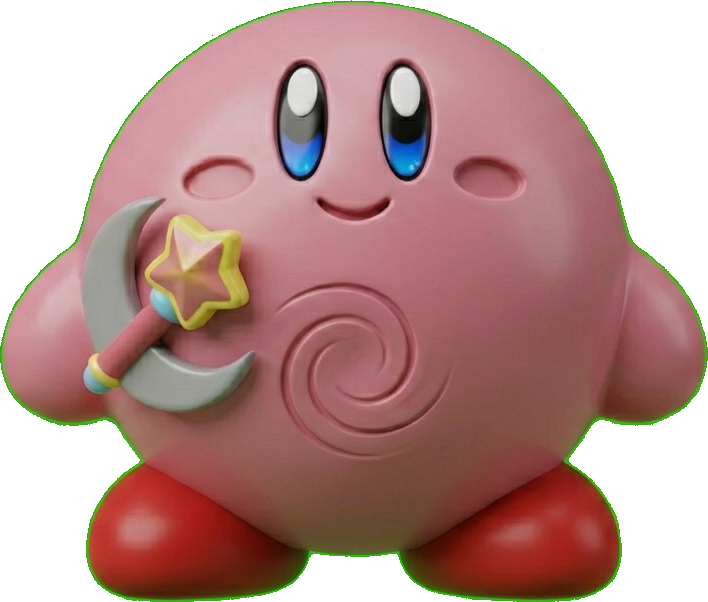
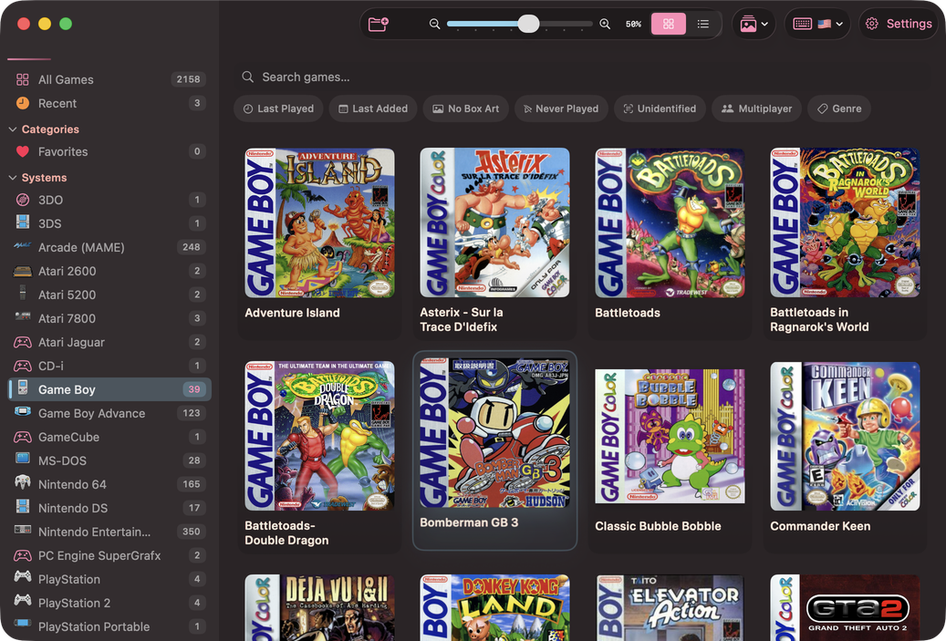
Kirby
A playful pink as cheerful and unmistakable as Kirby. Brings warmth and personality to every surface.
Troubleshooting
Theme changes not visible
Symptom: After selecting a new theme, the interface still shows the old colors.
Solution: Theme changes require an app restart. Click Apply Theme and confirm the restart dialog. If you dismissed the dialog, close and reopen TruchiEmu manually.
Custom color resets on launch
Symptom: The custom accent color reverts to the default teal after restarting.
Solution: Make sure you clicked Apply Theme after choosing your custom color. Simply picking a color in the Color Picker is not enough—you must apply and restart for the change to persist.
Unsaved changes warning
Symptom: A dialog appears when navigating away from the General settings page or closing the window.
Solution: This is intentional protection for unsaved theme changes. Choose "Apply & Restart" to keep your changes, "Discard Changes" to revert, or "Cancel" to go back and keep editing.
Theme looks different in light vs. dark
Symptom: The accent color shifts slightly between light and dark appearance modes.
Solution: This is by design. Several themes define per-mode accent variants for better contrast. If you prefer a consistent accent regardless of mode, the Custom theme uses the same color in both.